You are here
Good architecture is always staged. Sadly, so is bad architecture.

Exhibitions emerge from an interplay between the space and the exhibits. The spatial staging - in scenography as well as in architecture - has an impact on the way people perceive and use it, as Tristan Kobler points out.
Katharina Marchal: Until 1996 you were a scenographer and curator at Museum für Gestaltung in Zurich, and you realized some 60 exhibitions. How did that influence your work as an architect, particularly in terms of designing museums and exhibitions?
Tristan Kobler: Understanding how a museum operates makes a museum project easier to access. Experience of translating content and narrative into a museum layout has sharpened my awareness of space, which needs to be continually reconfigured depending on the theme, message and exhibits. I have practice of designing completely different exhibitions in the same space, and have always set myself the task of creating a fresh, strong and surprising picture.
I have always seen the museum as a laboratory, and exhibition design as an experimental arrangement for conveying messages and ideas. It has always interested me that people’s behavior can be influenced by how content is communicated and by the atmosphere in a room, and to what extent I can steer their behavior through staging.
Staging is obviously not limited to the exhibition design itself; it is an integral part of the architecture. The architecture of a building, be it a museum, an apartment building, or a discotheque, is always staged, but unfortunately not always intentionally. Every building and every space within or adjacent to it evokes a particular kind of behavior. Good architecture is always staged. Sadly, so is bad architecture, because it is unaware of the mechanisms at work and therefore the staging is accidental.
An administrative building, for example, can be designed in an authoritarian manner or not. The way it is used will prescribe certain functions, but that does not define the atmosphere or how it is staged. If I put a door handle at eye level or above, as if it were something out of a Kafka story, or if I instead fit automatic glass doors, I am creating completely different messages that will alter the perception and conduct of the users. For this reason, I cannot and will not draw a distinction between scenography and architecture.
Architecture can also provoke and trigger discussion between the general public and professionals. Engaging in such discussions can sometimes be arduous, but it is very important. It promotes cultural discourse not only among experts, but also with the wider public. As a designer, you deal with specialists from diverse fields, with different points of view, and you are always learning. Particularly interesting are those themes and ways of working that cross boundaries, breaking away from established procedures and generating fresh results.
My work in museums has shaped me insofar as exhibition design is always oriented toward the public – as indeed is architecture for me.
KM: How do you develop a concept for an exhibition? Can you explain this through the examples of two of your exhibition designs Realstadt and Look Out, which seem to have two very different approaches?
TK: The concept for the special exhibition Realstadt grew out of the background to the project. We had to organize this exhibition within a year or even less. The timeline for most museum exhibitions is generally two to three years from conception to completion. The starting point for this project came from the winning designs in the National Prize for Integrated Urban Development and Building Culture, presented in 2009 by the Federal Ministry of Transport, Building and Urban Development. Curators Martin Heller and Angelika Fitz were given the task of coming up with a concept for a public exhibition. They brought us in as designers from the very beginning of the project. Together we drafted the exhibition content, plot and scenography in a series of workshops. Early on we decided to make the exhibition about the city, and, more specifically, about a typical, familiar German city.
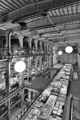
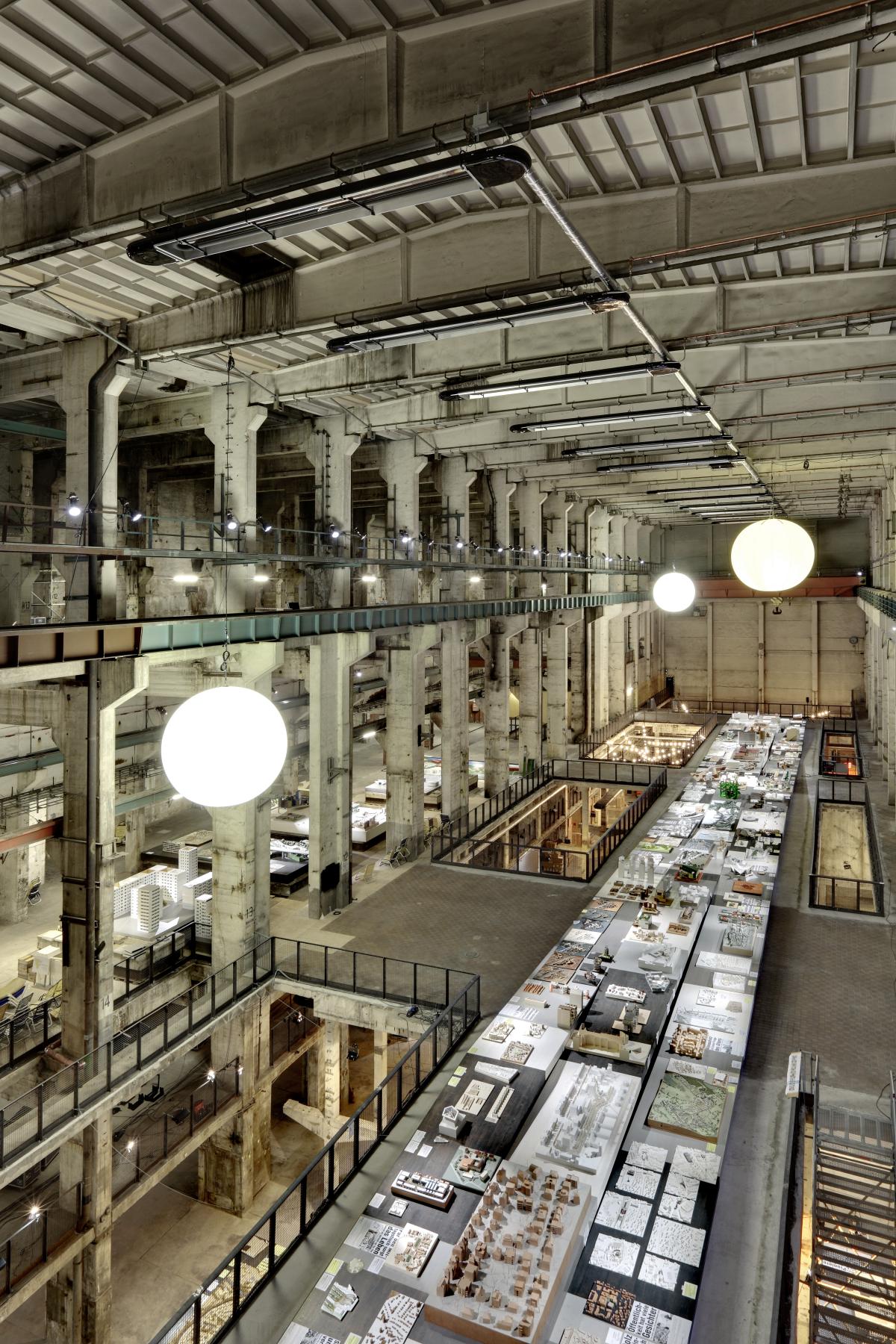
It was to be directed at the general public, not only a specialist audience. That’s why we didn’t choose a classic exhibition venue with a conventional visitor profile. In the search for suitable spaces, we were mainly looking at abandoned industrial sites in Berlin. Our favorite place was the turbine hall of the former power station in Berlin’s Mitte district, built in 1961 and with around 8,000 m² of usable space. The only downside was that in order to obtain a permit to use the space for an exhibition, we had to get some building work done. We were careful to keep the character of the space and retain the traces of its industrial past. For us, the space itself was an exhibit: on the one hand a ruin, on the other a shell, a space with lots of potential but that was no longer obviously occupied. We were also fascinated by the model-like quality of the space, which made it the “supermodel” in an exhibition full of models.
Most of the submissions in the best practice competition of the National Prize for Integrated Urban Development and Building Culture were panels with texts, photos and a few models. We reworked the panels and put them together to form a larger exhibit. They were the starting point for the process of getting urban regeneration stakeholders involved – a very diverse collection of individuals, groups, authorities and professional planners. The project addressed various themes such as demolition, redevelopment, building density and users’ needs. Our theory was as follows: the city is a projection of many different desires for an “ideal city.” In other words, it is produced and designed by various players such as urban planners, investors, private initiatives and other stakeholders. In addition, every historic city contains buildings from very different periods with the social attitudes that accompany them, and so forms a conglomeration of often conflicting aesthetic and political stances. Cities, as a whole, are thus always a patchwork and never “perfect.”
To portray this idea, we sought out very diverse models of buildings, neighborhood development and urban development in Germany. We issued an open call for models on the Internet, with the aim of uncovering not the best of the best, but rather the most diverse array of models, which we could then put together in a new city. The selection finally compiled by the curators and exhibition organizers represents in model form the haphazard, more realistic nature of a constantly changing city.
The exhibition thus shaped a new city in its own right. The city models, some of which were very large, were laid out close to one another on the ground floor, and we arranged the single models on a long table six meters by 80 meters on the first floor as a new city.
However, we intentionally left only a narrow passageway of no more than 1.20 m beside the table, to encourage the visitors to interact with one another and with the exhibits, and vice versa. To make sure that all the models were at the right height, we sculpted an abstract topography out of the tabletops. The next step, as in any design process, was to plan where to set the models and, above all, to make adjustments once they were in place.
We have already emphasized the open, collaborative approach we took to content and design, working in close partnership with Martin Heller and Angelika Fitz. Our philosophy is that, as far as possible, content and form should not be separated, but rather be brought together very early on in the process.
KM: How did you approach the exhibition Look Out. Architecture with a View in SAM, Swiss Architecture Museum, Basel?
TK: In the same way: content defines the form and vice versa. The two are very closely connected.
Here, too, there was a choice of projects – buildings, towers, viewing platforms, all offering a vantage point over the landscape. We did not initially know how many projects would be exhibited. Our starting point was the concept itself and a shortlist of possible different projects. On this basis, we were able to suggest how many projects could be exhibited in the space. A key factor in our considerations was, of course, how the space had been used for previous exhibitions. It is exciting how the same space can be continually re-invented, and how that space can be staged to convey a given theme. The Swiss Architecture Museum is firmly anchored both in the city and in people’s minds. It boasts classic exhibition spaces with very high windows looking directly onto the street and conventional stucco ceilings. Really it is a white box, similar to a gallery. We didn’t want to alter this feeling by making the space too full.
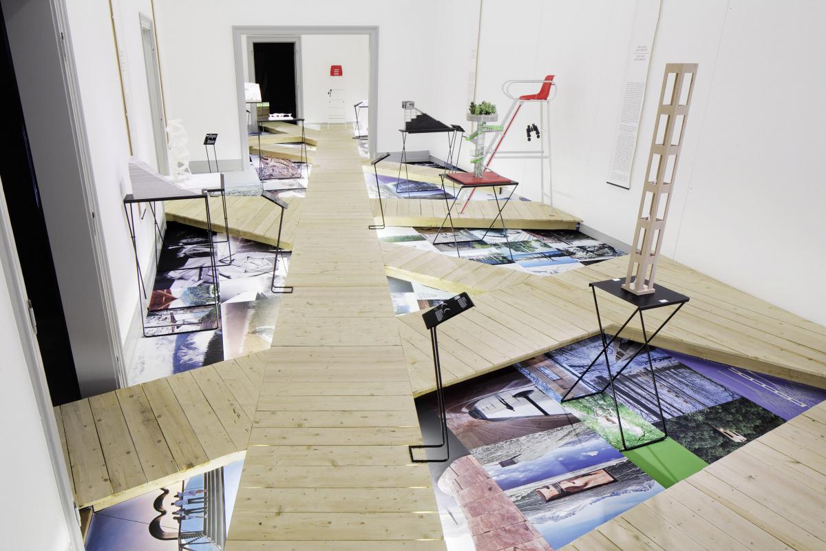
The theme of the exhibition – gazing out over the landscape – is not restricted only to lookout towers and viewing platforms; rather it encompasses all the other aspects involved in walking around a place. The viewing platform might be the goal, or the highlight, but there is always a path leading to it. Sometimes, getting to the viewpoint is actually the most important part. We transferred this idea directly into the exhibition concept. From the wooden walkways that lead through the exhibition, the visitor gazes upon an artificial, architectural landscape. The pictures on the floor offer a bird’s eye view while the models are set at eye level. From the tall chairs, visitors can look down over the whole room through binoculars. And thus we created a multi-level topography. The interaction between the “walkers” is another important component of the concept. Observing and being observed is a theme that we find echoed in the staged space. We cannot simulate the natural setting, or to be more precise, we cannot simulate the experience offered by these structures in their natural setting. But through raised walkways, dead ends and high-up seats, we can allow visitors to negotiate their way through the space in such a way that they engage with the central theme of observation in new and different ways.
KM: What is the relationship between the exhibition architecture and the exhibits?
TK: The artwork or the exhibit always stays the same. However, it makes a big difference if I put it in a white room, or in the stairwell, or in a bus station. An exhibit is always directly connected to its surroundings. Large pictures require spaces with high ceilings whereas miniature objects get lost in a big hall. However, depending on your particular objective, it is sometimes precisely by disregarding well-established rules that you can achieve the desired effect.
It is rare to be able to choose your own exhibition space, as we did with Realstadt. The designated space thus has to be adapted to effectively convey the message, so that there is a meaningful interaction between the exhibits and the space that can be experienced and understood by the visitors. The design is tailored to produce the desired effect. In this sense, exhibitions are manipulative.
KM: Which spaces have a lot of potential, which are simpler and more versatile, and which are more difficult when it comes to designing an exhibition?
TK: The Architecture Museum in Basel is a very simple space with a strong, distinctive architecture. Its size and shape mean that the space can be redesigned with relatively little effort. Here the question is more about how to manage the interplay between the space and the exhibits.
A more difficult but fascinating space, also in relation to installations, is the Guggenheim Museum in New York. Dominating spiral forms do not lend themselves easily to exhibition design. The challenge is to work with this architecture in such a way that its effect is enhanced by your interpretation and that you manage to keep surprising visitors to a building that houses very powerful exhibitions.
The simplest, most minimalist type of space is the so-called white cube. This is a white, neutral space such as one often finds in art galleries, where the purpose is to display the works in isolation, removed from any external context.
In the Heimatkunde exhibition, we played around with the type of white spaces usually found in modern art museums, but this time within the older building of Berlin’s Jewish Museum. The exhibition contained only work from Jewish artists, all of whom operate in both their own culture and their adopted culture. We chose to represent this cultural overlap as a spatial concept, and duplicated the existing spaces within the original building in a rotated and slightly tilted white cube. In this way, both spaces exist at the same time, and the slightly disorienting perspective allowed visitors to physically experience what life between two cultures feels like.
In contrast to the white cube, a black box represents an impartial vessel in which to stage a production, as we know from film studios and the theatre. With a scaffold suspended from the ceiling, dark floors and windowless walls, the space is completely cut off from its surroundings. In this way, it is the highly staged set that creates the desired atmosphere. Although staging an installation in a black box requires a lot of effort, this type of exhibition has become very popular in recent years. That perhaps has something to do with the fact that consciously staged installations have for some years drawn large audiences.
We built the exhibition Qin – The eternal emperor and his terracotta warriors in a black box in the Bernisches Historisches Museum. In a windowless room seven meters high, akin to an empty warehouse, we were able to build on two levels. A ramp led the visitors down into the basement, where they found themselves in a space reminiscent of the tomb where the warriors were originally found. Eight thousand silver flags hanging from the ceilings represented the vast number of warriors in the first emperor’s terracotta army. They appear to form a glistening tide of mercury, thus symbolizing the “elixir of life” that is said to have killed Qin.
These examples reveal two quite distinct attitudes and approaches. One is: I can do anything – staging it in a black box. The other is: I’m going to get as far away as possible from the everyday world outside – working with a white cube. The color white radiates a certain sense of purity. It is the color of modernity, of cleanliness, hygiene and renewal.
KM: What was the relationship between space and content in the 2010 exhibition Mise en scene <ex 545> in Berlin’s Architektur Galerie?
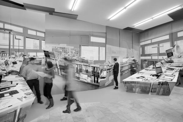
TK: Architektur Galerie Berlin is a small exhibition space. Though the room is largely conventional, the large display windows open it up to the surrounding urban space. From the outset we knew that we did not want a conventional monographic exhibition with plans and models of our projects on the walls and tables. Instead, we reproduced our real working environment to illustrate how we work. The photographs show our office spaces from a variety of angles and perspectives, which we reassembled, manipulating the colors to create an abstract effect. An exhibition, like architecture, is always an abstraction of an idea or a thought. Designers encode meaning and viewers decipher it.
I should say one more thing about the title. Jean-Luc Godard saw montage as an integral part of the mise-en-scène: montage simply does in time what mise-en-scène does in space. Both are principles of organization.